

More than once, I have been absolutely positive that I’ve painted every square inch of this room…but then I find something else that needs attention and I’m back at it, paintbrush in hand.
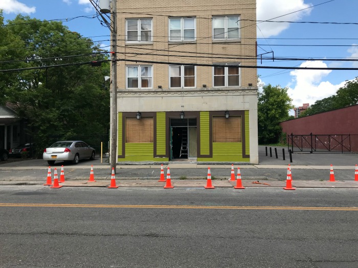
The outside of our building is in good condition, thankfully, but it’s very bland and vanilla. I knew I was going to have to jazz it up a bit to grab the attention of potential customers driving by, and with the interior projects wrapping up I was able to turn my attention to our facade.
Last fall I added a pair of window boxes to the windows that flank the front door. I had mums out there when we originally installed them, but this year I decided to wait until we were closer to opening – it was too hard to keep them alive when we weren’t around to consistently water them.
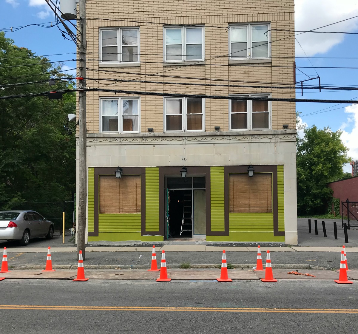
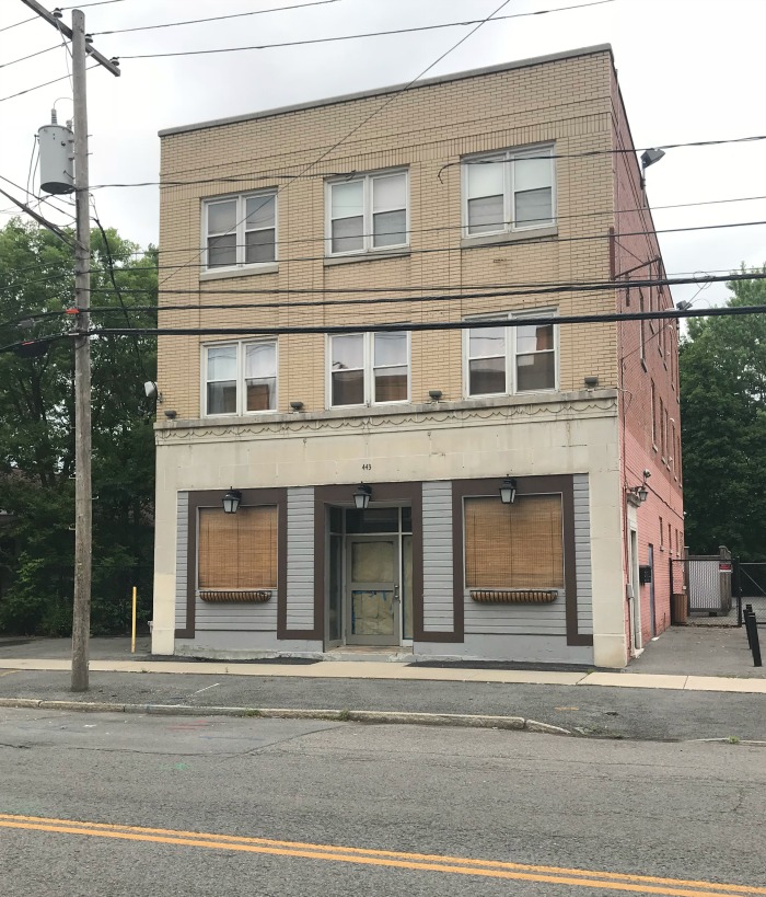
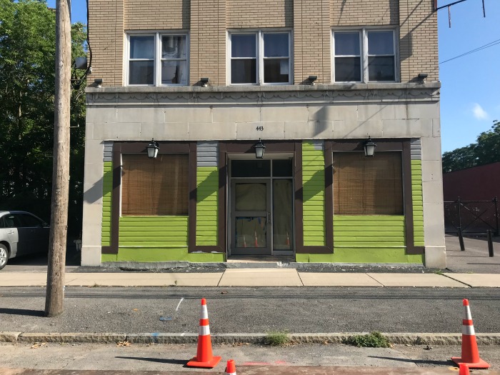
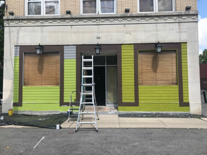
Most of the building is masonry and brick, but there are small sections on the facade that are wood and currently painted light gray with brown trim. I decided to give those areas a splash of color with a coat of fresh, avocado green paint.
The existing number 443 over the main entrance on the building was tiny and hard to see, so I found some gorgeous, 12″ high architectural copper numbers on Etsy to replace them and split the cost with my brother-in-law/landlord.

I cannot wait to get these hung up!
The gray wooden area I wanted to paint isn’t very big, so I didn’t think it would be that bad of a project. Of course, conveniently forgot that I would need to scrape the loose spots, then slap primer on those areas.
What’s more fun than scraping a building on a hot muggy summer day?
Anything. Literally, ANYTHING.
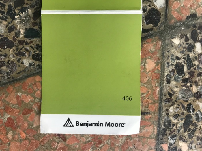
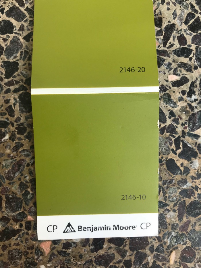
The color I was aiming for was a muted, avocado green…something like the avocado appliances from the 70’s, but just a tad brighter. This was the paint swatch I picked out:
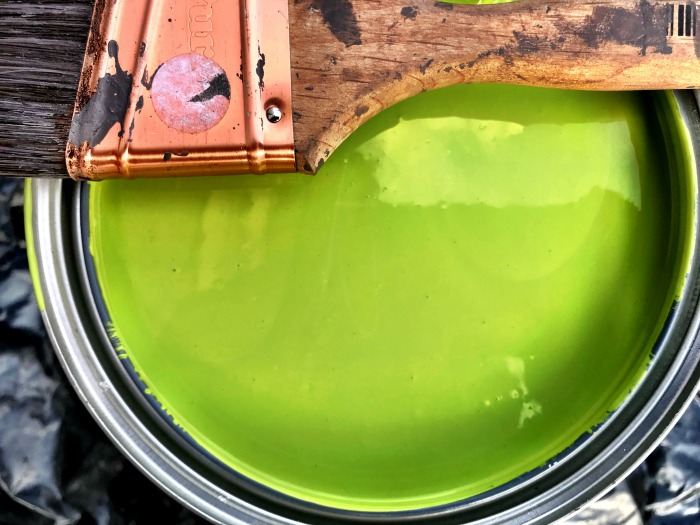
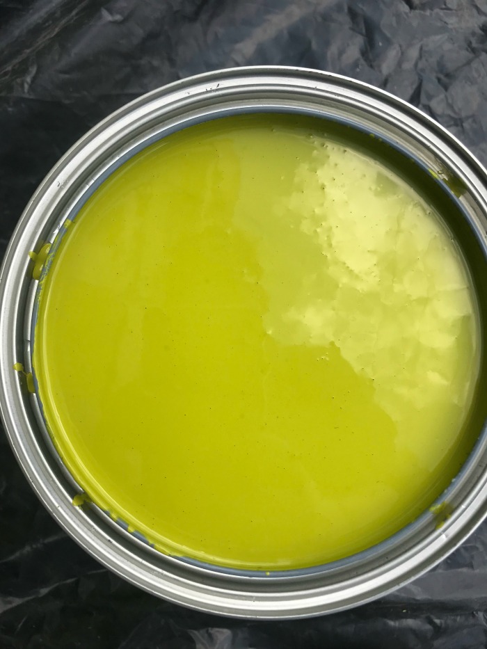
You can imagine my surprise when I opened up the paint bucket and saw this:
Photos were taken in the same location and in the same light, BTW.
I was freaking out but powered through anyway.
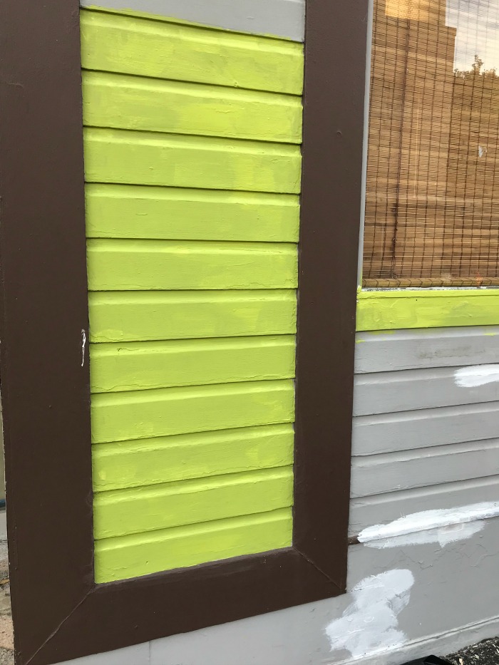
Holy shitballs…it was 90’s Neon Freaking Green
Highlighter green. Electric green. Neon vomit.
Like, I need to dig out a scrunchie, put on some parachute pants and don a pair of giant ugly plastic earrings.
I talked myself off the ledge because I know from experience that seeing a new bright color on top of an old neutral color that you are used to looking at is jarring. 99% of the time it works out just fine. Besides that, I am usually a savant at picking out paint colors.
Usually.
But not on this day. On this day, my paint choice was the 1%.
On Saturday I got a coat of paint on most of the facade and then I went back Sunday morning to assess. It was too bright, too neon, and too 90’s, so back to the paint store we went.
My second attempt was a paint color I had rejected the first time as being too dark and too muddy looking.
Uhhhhhhh…no. Not dark, not muddy. Actually still really, really freaking bright.
Apparently, bright sunlight renders ALL paint colors a crazy neon hue?
In the photo below, the left side is Screaming Green #1, the right side is Screaming Green #2 – both with just one coat of paint.
Less lime, less neon, but still blindingly bright.
I may have cried a little.
But, I was bound and determined to give it a fair shot, so I persevered.
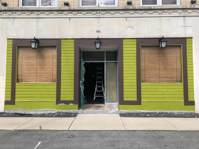
It still needs a 2nd coat and I have to touch up the brown trim and give the masonry across the bottom another coat of gray paint. And I should probably shop-vac up the paint chips.
It IS avocado, but it’s not the muted subtle shade I had envisioned.
My brother-in-law/landlord does NOT dig it.
After spending 2 very sweaty afternoons in a row slathering our building with paint colors I didn’t love I decided the best course of action was step back and just live with the color for a bit.
It’s a lot brighter than what I envisioned, but the whole point is to catch people’s attention, right? And, with the addition of my new copper numbers, the flower boxes filled with orange and yellow blooms, giant, lush planters on the ground plus our orange and gold sign, I think it might actually work. We are located on a very drab, lackluster stretch of road with a giant eyesore right across the street…so maybe a bright spot of color isn’t the worst thing in the world, right?
We have agreed to reserve final judgment until September when it’s (hopefully) a bit cooler. If everyone has not learned to love it at that point I’ll make one more stab at toning it down.
In the meantime – I’m sunburned and exhausted and I’m enjoying an adult beverage on my deck.

CHEERS!